Tuesday, February 15, 2011
Assignment 2: Muhammed Muheisen
Pakistani, from left, Najibuallah Gulbaz, 28, Ahmed Bakhi, 35, and Awal Khan Raja, 40, are seen during a break from work in a coal mine in Khwera, south of Islamabad, Pakistan, Tuesday, Jan. 5, 2010. (AP Photo/Muhammed Muheisen)
This photograph by Muheisen is a stand out to me since it doesn't follow the rule of thirds. It's clearly centered but it still manages to have an impact visually. There's a nice contrast with the light and dark areas. Also subject wise it also impacts. One thing I wonder is if Muheisen stages his photographs when people pose. Or was he just there when they just emerged? I believe it's mix of both. He probably had the two people in the back stand more within the shadow and he had the middle man stand in the light to make him pop more.
Assignment 2: Andreas Gursky
After researching over Andreas Gursky a bit, I began treating his work as 2D art. It's beautiful how he perceives his spaces and shows so much detail. It's a nice balance (the photograph above) how he carefully composes his large images. There's a semi-monotone look. The sharp contrast between the roads and the dirt makes the image pop. Also the faint blue sky nicely transitions from cool to warm. While looking up his images it was interesting seeing them in a small scale, where details blend to form almost a pop-art look to it.
Assignment 1: Critique
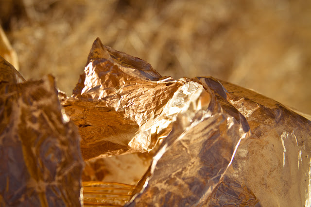
For my assignment I used the color 'mystic gold'. For the images I wanted to create something semi-abstract and of course- mystic. One of the things I tried to do is use closeups of a material that was painted gold. It was pointed out that yes they are gold, but are they perceived as mystic to the viewer? Some images were seen as what I intended and others were not. The one that was successful was shot at an angle where I was trying to mimic a landscape. (top image) And the one where it seems to fall flat and doesn't connect visually was shot at a direct angle while trying to manipulate the image with select focusing. I do believe the type of paper that I used (matte enhanced) failed to translate the visual appeal that I see on the screen.
Subscribe to:
Comments (Atom)


